Search results of January 2nd 2016

How to interpret a control chart?

The need to use a control charts sometimes scary because it sounds like ‘statistics‘, ‘only for advanced organizations‘, ‘only if the process is stable‘, etc..

All this is absolutely wrong!

If we are overweight, are not we going to look at the scale until our weight stabilizes / lower?

Usually control chart is not used because because one doe not know well how to interpret it.

Look at this picture, please.

Carretera

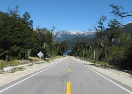
The white lines mark the road límits whithin which a car has to go (for now let us assume that there is only one lane). A car always moves a little closer or further from the white lines, the important thing is that it is within these limits. Goint out of them is paid and investigated (exaggerating a bit)

In mathematical terms these lines are called control limits.

Control limits determine the range in which some parameter values vary naturally. These limits may be different for each product, technology or service level agreement (SLA). For example, the effort for fixing bugs in your application. net can vary between 2 and 5 hours, and the correction of bugs in the same application for Android can vary between 1 and 3 hours.

Your analysis of the parameter has to be focused on the following aspects:

  • Are the values within the control limits?
  • In case that a value is beyond the control limits (eg, more effort has been dedicated to the correction of a bug), why has this happened? Analyze the causes, take action and learn, so that the case does not happen again
  • Looking at the trend of the data, are the values uniformly distributed or get closer to any of the limits?

Now look at this other photo.

parked_cars_with_road_lines

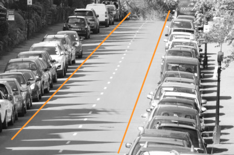
Because there are other cars parked in the street, our car can not go close to the control limits and must go between the orange lines (I added them). This is the case when the organization has defined limits that determine the acceptable range of variation (movement) for a parameter.

In terms of control charts these limits are called specification limits.

The reasons why an organization defines specification limits can be various: SLA, client expectations, economic margin, competitive reasons, etc.

In case that a parameter must respect the established specification limits, your analysis will have to consider the following additional aspects:

  • Are values they within specification limits?
  • In case that value is beyond a specification limit, why has this happened? Analyze the causes, take action and learn, so that this case does not happen again.

Here’s an example of a control chart with control limits (in blue) and an upper specification limit (orange).

GraficoControlConLimites_eng

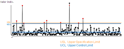
In this case all red dots have to be analyzed because some of them are above the specification limits (set by the organization) and the other ones surpasses the control limits (natural variation).

If you have any doubts, let me know.

Related posts:

Cumulative Flow Diagram. You Still Do Not Use It?

If you are accountable for delivering results to your customers and you do not use yet a cumulative flow diagram (CFD) to manage your development projects and/or services, open your eyes for this tool. You will want to see it daily.

Work is considered done when it is delivered to the customer, isn’t it? Only then we can charge for it.

Therefore agile teams measure project progress by means of the number of features/stories delivered to the customer. In the very beginning Scrum started using the burn down chart showing the number of hours (or story points) remaining to completing the backlog. Later burn up charts got to be used. These plot the number of features completed by the team each day.

This information together with the velocity metric is used to project a sprint/iterationcompletion.

BurnUpChart_En

However, taking into account only the finished work is not enough.

The Little’s law is telling us that the Delivery time depends on the Work In Progress (WIP). WIP is all work which has been initiated and not yet finished, i.e. all work between Analysis and Done.

CFD_LittleLaw_En

So, the first think you have to keep an eye on is the WIP.

If WIP increases, your delivery date is at risk.


Therefore, it is much better to work with smaller sprint backlog / iteration scope (batch) sizes than with larger. Moreover, keeping a smaller amount of WIP reduces the effort spent on task-switching.

Reducing batch size increases the speed of delivery.


As a good manager, in addition to knowing what is being currently developed, you will want to know what the state of the work is, which of work items are experiencing problems, have defects, or impede the implementation of others. It is your job to ensure obstacle resolution and continuous work flow.

According to the Theory of Constraints, every system has at least one constraint (bottleneck). So you have to

  1. Identify the constraint
  2. Decide how to exploit the constraint
  3. Subordinate all other processes to the decision taken at step2.
  4. If after step 2 and 3, more capacity is needed, elevate the constraint.
  5. Go to step1.

How do you spot the bottleneck in your workflow?

From the Law of the bottleneck, you know that a bottleneck is the place where the throughput is lowest. Usually there is a queue before that place and the performance after that stage is not optimal. As an example, think of a tall at a high speed road, a transport bridge at a peak hour, or a security check point at an airport.

Going back to our software development workflow, we can visualise the amount of work items in each different stage from the workflow (analysis, implementation, testing, deploy, done) using lanes with different colours.

CFD_En

Now observe if there is a lane that is getting thinner while the one corresponding to the previous stage in the workflow is getting wider (equivalent to a growing queue).

CFD_Bottleneck_En

If you see this pattern, apply the above mentioned steps to resolve the bottleneck.

Keep in mind that when we see a bottleneck, we instinctively think that we need more resources. However this is usually the most expensive solution and not always the best one. See chapter 17 Bottlenecks and Non-Instant Availability in David Anderson’s Kanban book about more details on resolving bottlenecks. You might also like Esteban, the Bottleneck story.

In Cumulative Flow Diagram Pawel Brodzinski shows a number of other CFD patterns that you could find when using this chart.

To resume,

Cumulative Flow Diagram is a practical tool that helps you see the state of the WIP, your project pace and identify quickly risks associated to delivery time as well as bottlenecks.

Drawing a CFD manually requires concentration and good numeric representation skills. However, most of the Kanban tools draw this graphic automatically for you. In addition, you can choose which states to track.

For traditional management organizations:

If you are used to tracking progress against plan and estimating end date based on project’s critical path, using the CFD will still be useful for you for:

  • Identifying project delay risks before receiving the next project status report
  • Spotting impediments in the workflow and eliminate them before suffering their impact on accomplishing project schedule
  • Get at a glance a complete picture of current work state and project pace.

Moreover, the data you need for plotting the CFD is only work item (task, requirement, story, ticket, incident) status and the time it has been in process (lead time). Corporate tools usually keep this data. What is crucial, of course, is that the data is correct, not manipulated.

Related posts: