Search results of January 2016

Lean Kanban Analytics: Efficiency

Efficiency_En

Efficiency is an indicator of how lean your organization is.


With respect to ITC companies:

  • Flow efficiency of 2% has been reported [Zsolt Fabok, Lean Agile Scotland, Sep 2012]
  • Efficiency between 5% and 15% is considered normal
  • Efficiency > 40% is good!

What causes the low efficiency?

As well explained in This is Lean, there are three main sources of low efficiency:
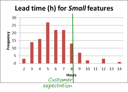
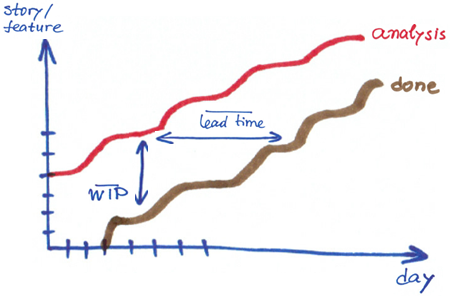
Long Lead time

Waiting too long for a product or service generates additional needs for the customer that also need to be addressed and usually cause additional delays.

To give an example: the longer a customer waits for the solicited application or service, the higher the probability to ask for changes or even cancel the order. In addition, managing changes increases the delivery time (Lead time) even more.

Hence

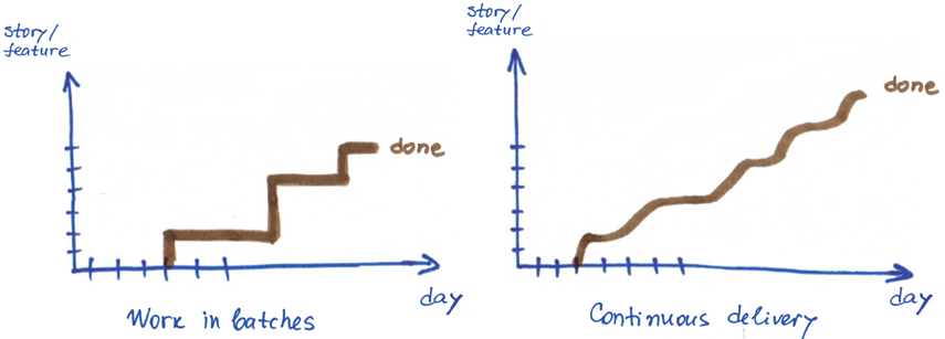
Agile teams are more efficient because they use short time iterations.

Decreasing delivery time is one of the means to increase efficiency.


A manner of decreasing delivery time is reducing the size of the work items and the batches. Therefore, when I see requirements of 500-1000 person-hours each, and iterations of 3+ months, I always recommend reducing both the requirement size and the iteration duration.

Reducing the requirements size increases efficiency.

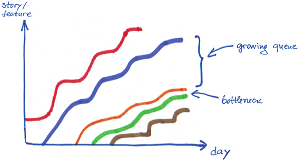
Too many work items in process

Working on too many items in parallel

  • Requires additional effort, time and resource to manage them: know what was done in each one of them, where it is stored, what is pending, etc.
  • Leads to multitasking, which is another main source of inefficiency. Here you can see a good summary of high cost of multitasking.
  • Hides problems because when there are many open work items, it is difficult to spot and fix well quality problems.
  • Causes anxiety and stress which reduces the quality of the work, increases problem-fixing time and hence reduces efficiency.

Therefore,

Reducing the work in progress in a kanban system increases workflow efficiency.
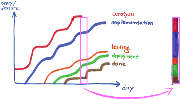
 

Too many handovers

Remember how you feel when you call, for instance, your mobilephone provider and you are transferred from an operator to an operator and each time you have to explain your problem from the very beginning. From customer perspectives many handovers generate frustration.

From service provider perspective handing over a work item to another person always carries the risks of losing information and generating defects. In addition any work transfer requires additional effort and time for explaining, orally or in written form, the current status of the job and what has to be taken into consideration in the subsequent steps.

Handovers cannot always be avoided however working in
multidisciplinary teams reduces their negative effects.


Related posts:

Lean Kanban Analytics: Lead time

Lead time

(Delivery time, System delivery time)

Lead time is the time that passes from the beginning to the end of processing a work item.

Examples:

  • You decide to buy on internet an airplane ticket for your holidays. The lead time of acquiring the ticket will start at the moment you sit in from of the computer and open a browser, and will finish when you have your electronic ticket in your mailbox.
  • You want to see your doctor. The lead time of obtaining your diagnosis is the time between the moment you call for an appointment and the one of leaving the clinic with your diagnosis in hand.
  • The lead time for developing a customer requirement is the time from the moment your team starts working on it until the moment the feature is ready to be released, i.e. the time that passes between the moment the feature enters and get out of the kanban system (it reaches a column with WIP limit infinity).

SystemLeadTime_En

To measure well and consistently the lead time, it is important to know the borders of the kanban system.

Why is Lead time important for you?

  • The Lead time is an indicator of value. The quicker you deliver value to your customer, the better. However, customer expectations have to be taken into account as well. Delivering too quickly not always brings value. For instance, teaching an 8 hours class in only 6 hours will not make the alumni happier.
  • Lead time is crucial for service oriented companies because helps establish realistic SLAs as well as manage their completion.
  • Knowing the Lead time distribution enables predictability. Of course, it is important to know the Lead time distribution per type of work or class of service.
  • If in addition to the System Lead time, you observe the time each work item spends in a column (a state), you will be able to reduce waiting and like this, accelerate delivery and stay lean (waiting is one form of waste).
  • It might be interesting for you to compare the value-adding time to the Lead time, in other words check the efficiency of your work. An essential moment for a customer of mine was when they found out that work developed in 6-10 hours was delivered to their customer in 35-52 days!
  • In a stable kanban system knowing the work in process (WIP) and the Lead time allows calculating the Throughput (applying Little’s law). Throughput is similar to the Agile velocity metric. Observing its trend gives you an indication of the overall performance of your team.

Tools for analysing Lead time

Histogram

Histograma_En

Knowing the variation of the Lead time for features of size Small, and having an understanding of your context (clarity of the feature to develop, skills level of the team, technology, risks) you can more easily foresee the time it will take your team to implement a particular feature.

The real data already include information about the impact of the influencing factors on the development of this type of features. Therefore, you do not need a strict formulae to estimate the development time for a new requirement.

Make sure you know the Lead time distribution of your types of work
and classes of services and stop worrying about your commitments.


Histograma_2Modas_En

Something important. If you get a histogram like this one, with two modas, this means that you have mixed data of different types. Continuing the previous example, this would probably mean that you have mixed data about Small and Medium-size features.

Stratify the data to make sound conclusions.


Control chart

ControlChart_En

The control chart is another form of visualizing the same data you see on the histogram, together with its mean and the upper and lower control limits.

Have a look at How to interpret a Control chart for more details.

Analyse the causes for the points that fall outside the control limits. These causes are called special causes or assignable causes. If you are not satisfied with the distance between the control limits, you could analyse the common causes for the variation and address them to reduce the variation. Like this you will improve the predictability.

Using the charts for decision making

Histograma_Estimation_En

These charts are particularly useful when you have to estimate the risk of meeting a customer expectation.

Imagine that your customer expects a new small feature in one day only (theoretically 8 working hours :-) ).

How confident would you be in committing to deliver the feature on time?

And if the customer expects it in 6 hours?

Tools

The tools that support Kanban usually build these graphics from the data in the system.

Related posts

How to interpret a control chart?

The need to use a control charts sometimes scary because it sounds like ‘statistics‘, ‘only for advanced organizations‘, ‘only if the process is stable‘, etc..

All this is absolutely wrong!

If we are overweight, are not we going to look at the scale until our weight stabilizes / lower?

Usually control chart is not used because because one doe not know well how to interpret it.

Look at this picture, please.

Carretera

The white lines mark the road límits whithin which a car has to go (for now let us assume that there is only one lane). A car always moves a little closer or further from the white lines, the important thing is that it is within these limits. Goint out of them is paid and investigated (exaggerating a bit)

In mathematical terms these lines are called control limits.

Control limits determine the range in which some parameter values vary naturally. These limits may be different for each product, technology or service level agreement (SLA). For example, the effort for fixing bugs in your application. net can vary between 2 and 5 hours, and the correction of bugs in the same application for Android can vary between 1 and 3 hours.

Your analysis of the parameter has to be focused on the following aspects:

  • Are the values within the control limits?
  • In case that a value is beyond the control limits (eg, more effort has been dedicated to the correction of a bug), why has this happened? Analyze the causes, take action and learn, so that the case does not happen again
  • Looking at the trend of the data, are the values uniformly distributed or get closer to any of the limits?

Now look at this other photo.

parked_cars_with_road_lines

Because there are other cars parked in the street, our car can not go close to the control limits and must go between the orange lines (I added them). This is the case when the organization has defined limits that determine the acceptable range of variation (movement) for a parameter.

In terms of control charts these limits are called specification limits.

The reasons why an organization defines specification limits can be various: SLA, client expectations, economic margin, competitive reasons, etc.

In case that a parameter must respect the established specification limits, your analysis will have to consider the following additional aspects:

  • Are values they within specification limits?
  • In case that value is beyond a specification limit, why has this happened? Analyze the causes, take action and learn, so that this case does not happen again.

Here’s an example of a control chart with control limits (in blue) and an upper specification limit (orange).

GraficoControlConLimites_eng

In this case all red dots have to be analyzed because some of them are above the specification limits (set by the organization) and the other ones surpasses the control limits (natural variation).

If you have any doubts, let me know.

Related posts:

Cumulative Flow Diagram. You Still Do Not Use It?

If you are accountable for delivering results to your customers and you do not use yet a cumulative flow diagram (CFD) to manage your development projects and/or services, open your eyes for this tool. You will want to see it daily.

Work is considered done when it is delivered to the customer, isn’t it? Only then we can charge for it.

Therefore agile teams measure project progress by means of the number of features/stories delivered to the customer. In the very beginning Scrum started using the burn down chart showing the number of hours (or story points) remaining to completing the backlog. Later burn up charts got to be used. These plot the number of features completed by the team each day.

This information together with the velocity metric is used to project a sprint/iterationcompletion.

BurnUpChart_En

However, taking into account only the finished work is not enough.

The Little’s law is telling us that the Delivery time depends on the Work In Progress (WIP). WIP is all work which has been initiated and not yet finished, i.e. all work between Analysis and Done.

CFD_LittleLaw_En

So, the first think you have to keep an eye on is the WIP.

If WIP increases, your delivery date is at risk.


Therefore, it is much better to work with smaller sprint backlog / iteration scope (batch) sizes than with larger. Moreover, keeping a smaller amount of WIP reduces the effort spent on task-switching.

Reducing batch size increases the speed of delivery.


As a good manager, in addition to knowing what is being currently developed, you will want to know what the state of the work is, which of work items are experiencing problems, have defects, or impede the implementation of others. It is your job to ensure obstacle resolution and continuous work flow.

According to the Theory of Constraints, every system has at least one constraint (bottleneck). So you have to

  1. Identify the constraint
  2. Decide how to exploit the constraint
  3. Subordinate all other processes to the decision taken at step2.
  4. If after step 2 and 3, more capacity is needed, elevate the constraint.
  5. Go to step1.

How do you spot the bottleneck in your workflow?

From the Law of the bottleneck, you know that a bottleneck is the place where the throughput is lowest. Usually there is a queue before that place and the performance after that stage is not optimal. As an example, think of a tall at a high speed road, a transport bridge at a peak hour, or a security check point at an airport.

Going back to our software development workflow, we can visualise the amount of work items in each different stage from the workflow (analysis, implementation, testing, deploy, done) using lanes with different colours.

CFD_En

Now observe if there is a lane that is getting thinner while the one corresponding to the previous stage in the workflow is getting wider (equivalent to a growing queue).

CFD_Bottleneck_En

If you see this pattern, apply the above mentioned steps to resolve the bottleneck.

Keep in mind that when we see a bottleneck, we instinctively think that we need more resources. However this is usually the most expensive solution and not always the best one. See chapter 17 Bottlenecks and Non-Instant Availability in David Anderson’s Kanban book about more details on resolving bottlenecks. You might also like Esteban, the Bottleneck story.

In Cumulative Flow Diagram Pawel Brodzinski shows a number of other CFD patterns that you could find when using this chart.

To resume,

Cumulative Flow Diagram is a practical tool that helps you see the state of the WIP, your project pace and identify quickly risks associated to delivery time as well as bottlenecks.

Drawing a CFD manually requires concentration and good numeric representation skills. However, most of the Kanban tools draw this graphic automatically for you. In addition, you can choose which states to track.

For traditional management organizations:

If you are used to tracking progress against plan and estimating end date based on project’s critical path, using the CFD will still be useful for you for:

  • Identifying project delay risks before receiving the next project status report
  • Spotting impediments in the workflow and eliminate them before suffering their impact on accomplishing project schedule
  • Get at a glance a complete picture of current work state and project pace.

Moreover, the data you need for plotting the CFD is only work item (task, requirement, story, ticket, incident) status and the time it has been in process (lead time). Corporate tools usually keep this data. What is crucial, of course, is that the data is correct, not manipulated.

Related posts: